As the leader of a dynamic team made up of talented UX designers and UX writers, I had the privilege of acting as UX Lead on a pioneering project in the company. Developing and implementing a comprehensive UX strategy, my journey spanned from ideation to execution, marking the introduction of the company's first usability tests. At the forefront of prototyping and strategic leadership, we seek not only to transform the user experience, but also to establish new standards of innovation and effectiveness in our approach. This is the account of a journey that redefines not only digital interfaces, but also the limits of what is possible in terms of user experience in the company.

The Strategic Importance of the Institutional Website: The website is the official face of the company on the internet, receiving more than 10,000 visitors daily, generating 20,000 views. Our goal was clear: create a customer-centric experience, improve technology for fast, autonomous updates, and make it accessible and responsive. This would not only improve the user experience but also boost the company's NPS.
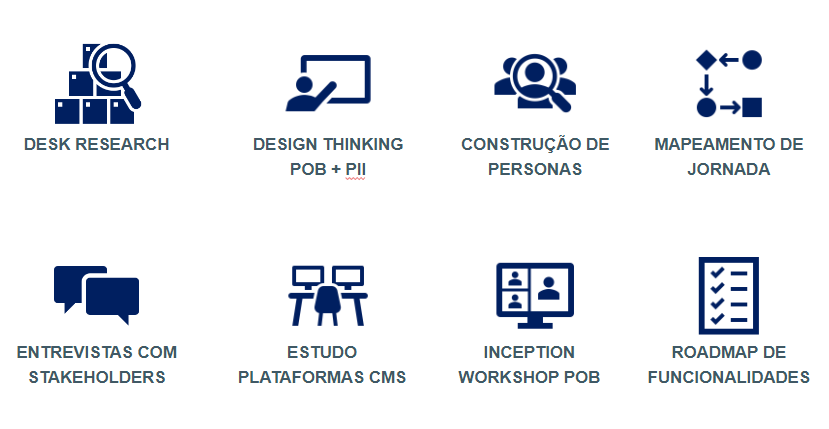
How We Made the Transition: We start with in-depth studies, market analysis, and feedback from customers and internal teams. Usability emerged as a key area for improvement. The active participation of users during the prototyping process was essential, with fortnightly validations carried out by internal areas, promoting the co-creation of solutions.

Development Highlights:
- We use cardsorting to map customers' mental models, structuring the website according to their logic.
- We adopted PII's visual identity, eliminating excessive technical and corporate language for greater proximity to the public.
- We restructured the product page for a more direct and accessible insurance storefront experience.
- Modificamos “Falar com Especialista” para “Fale com um Corretor” para maior clareza e eficácia.
Concrete Results: The new website saw an 18% increase in visits, with quick updates, thanks to the new Adobe manager. The implementation of Protection in Life, for example, took just one week, compared to three months in the previous process. Usability testing resulted in user satisfaction of 75%, indicating excellent usability.
Implemented Solutions:
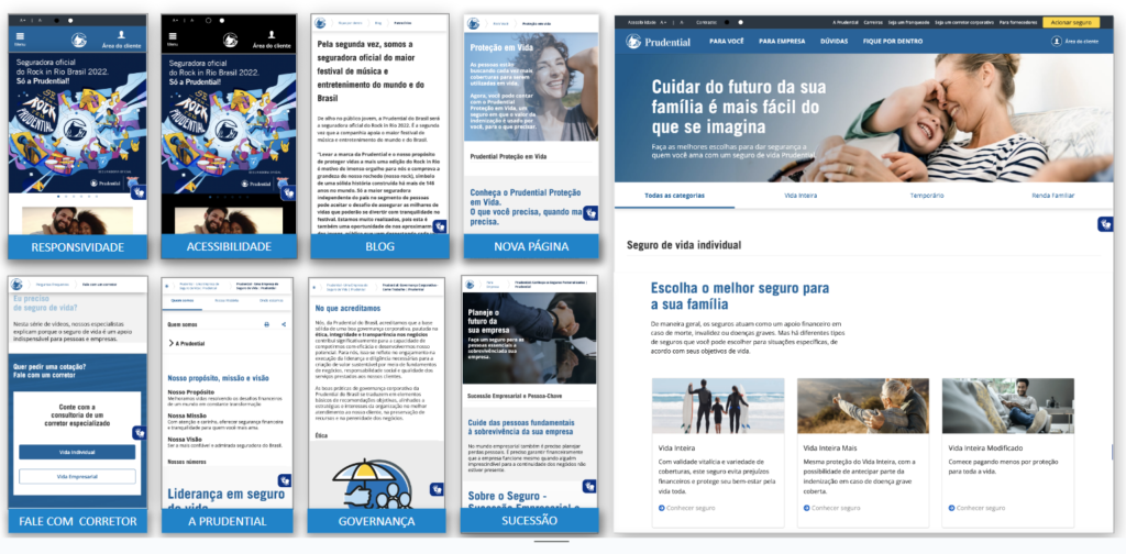
- Fully responsive website.
- Accessibility features like high contrast.
- New pages, including blog, Protection in Life and “Talk to a Broker.”
- More complete institutional information, including Corporate Governance.
- Expanded visualization of products, such as Business Succession and individual insurance showcase.

