Overview
The Oi 360º application is used in Oi physical stores to sell the operator's products. When I joined the project, the system was already underway and research had already been carried out by another previous team. My role has been to adapt the system to some changes in the company's business and new system features.
User
The app's users are salespeople and managers at Oi's physical stores.
Research
The project focused more on information architecture, but I carried out some user research.
Esses estudos foram para descobrir como hierarquizar e agrupar 20 novas funcionalidades no sistema.
Shadowing
I followed salespeople in Hi stores, each store has different audiences. The shadowing stage was carried out to understand how they currently use the system and explore improvements in the process.
In-depth interviews
To understand user needs, I visited 3 Oi stores and conducted interviews with 3 salespeople and 3 managers in total. It was possible to understand users' perceptions regarding the features being studied.
Cardsorting
Cardsortings were carried out with project stakeholders due to lack of availability of sellers. I created a hybrid model in which participants could write new categories. The study was carried out with 4 participants.
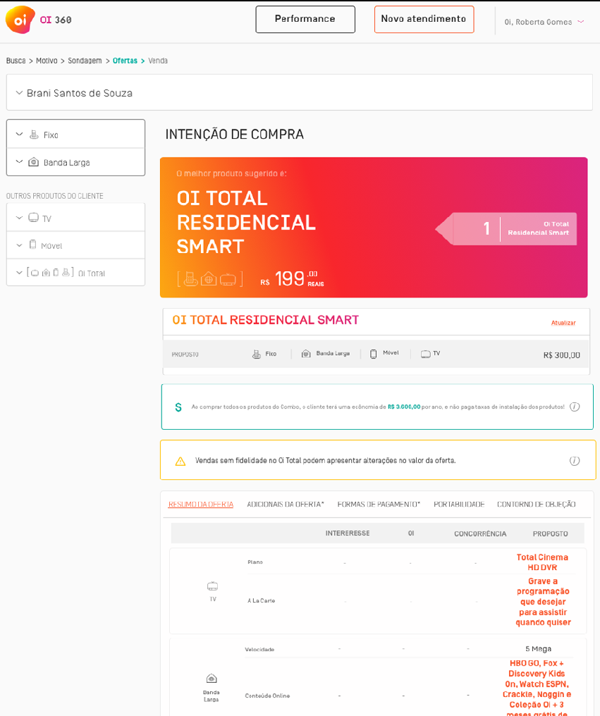
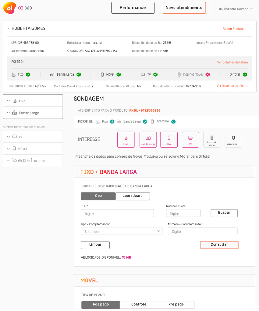
Below are some screens for this application:
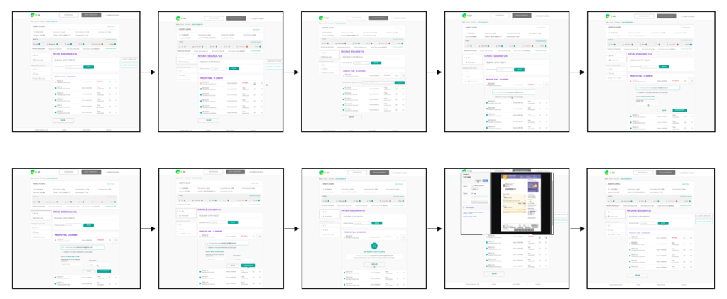
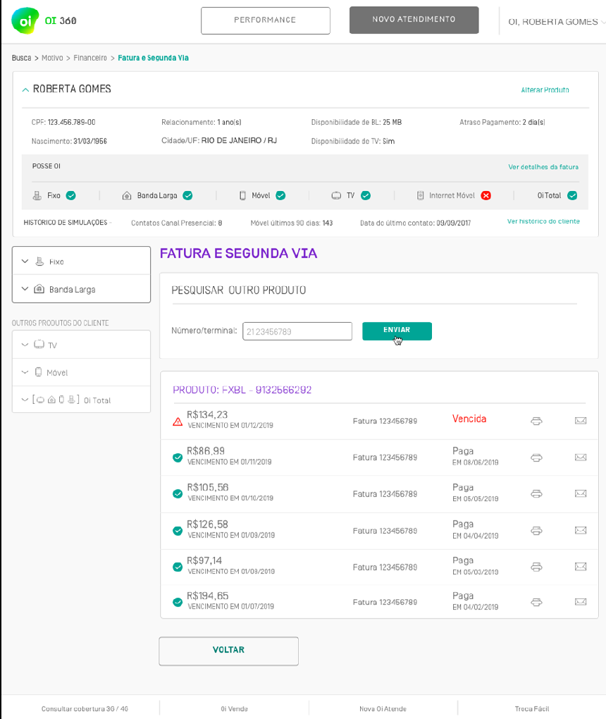
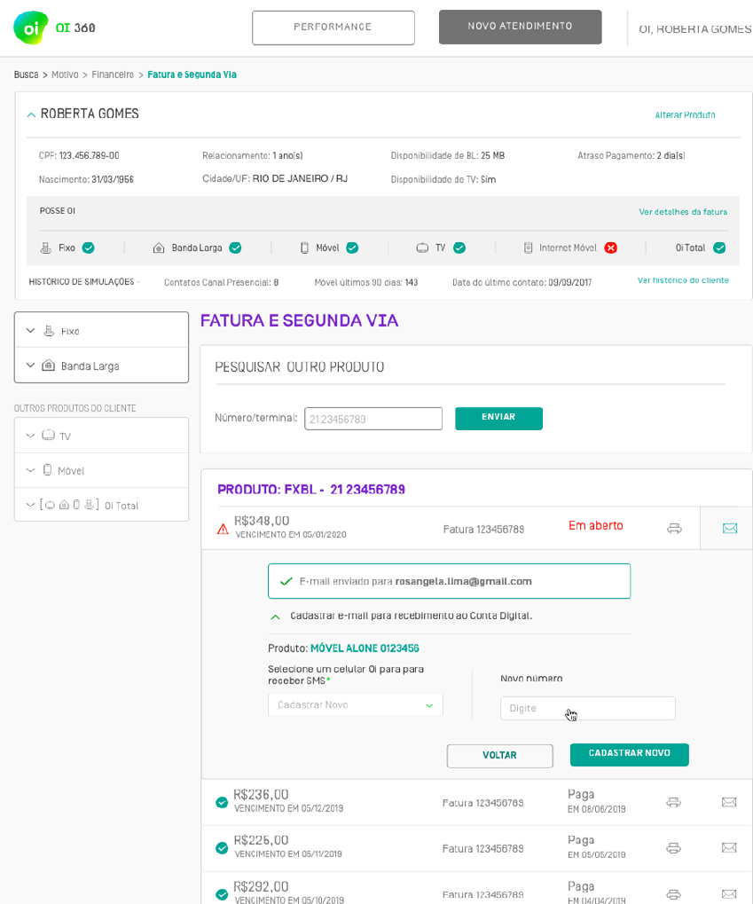
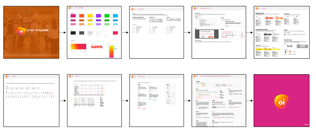
I also developed an update of the Design System, originally the Design System used predominantly the colors green and purple, as shown in the screens above and an evolution of the Design System in other colors was requested. I used other colors from the brand's palette and took the opportunity, in addition to just changing the colors, to work on the grid, spacing, in order to modernize the design system that was becoming obsolete, without radically altering what already existed, even to facilitate migration to the new design system.
